


There's a lot to encompass in a good design. It should follow the business' brand, but what if they've not got a solid one to begin with?
Well, then our designs will suffer too! I'm going to show how I come up with logo ideas, according to the
brand image, and then incorporate the result into social media publications.
Are there any initial requirements?
We'll need to talk to the client first, to gauge how much they have already decided on and how much
they are open to just seeing what our design process can come up with. I like to ask:
- Are there any particular colours that you like or that you already think can be linked to your brand? For us, they liked the idea of using green. This was something I could definitely get behind, as none of the current brands in that area use that colour. Also, thet wanted the logo to be modern, but respectable. Depending on the shade, I was sure we could find something to suite a darker theme (something we also talked about).
- Are there any other ideas that you already have that you would like me to explore? They said that they'd like the lambda sign to be incorporated as the main logo, perhaps with arrows to indicate a movement or direction of data flow.
- Are there any other brands already in this field that you like the style of? They said they really like the design around Serverless; they stick to their colour scheme well and they liked how much the orange of their logo contrasts to the dark background (see upcoming pictures in the next section).
Next up, research!
Even though not all of us can afford to run real-user interviews, we can make use of the client and the internet to do some
research, which can later support why we will make certain decisions for the design.
So I sat down with the client, who is actually a friend that needed this work done, and we went through
some of my findings together. In a future post,
I will go through how I collect examples of whatever I'm
researching and compare them. But below you can see the results:
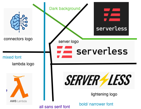
It is basically showing that:
- All the fonts are sans-serif
- No key or common colours used
- Each has a distinct logo or icon that is key to their business
Start drawing
Next, I start drawing out different logos, based on what we have observed. I find the prior
research always helps me get into
a good space to concentrate on the theme. In our case, it's all about making a logo to do with
serverless.
A bit of research into this (for context's sake) states that serverless technology
is simply where developers send application code to a server, which is run by a cloud provider.
These isolated containers are abstracted from the developer.
These containers are the responsibility of
some provider, which requires payment. AWS lambda is one of these providers. The Serverless logos that we have seen
actually refer to the Serverless framework, which provides a middlelayer for developers to interact with,
and it takes care of managing the different serverless providers.
One thing that I thought was important to note was that even though AWS use the lambda symbol in their logo,
in the Serverless framework (and if you use the providers directly) you will be writing lambda functions anyway, so
it's used to refer to both. So, we settled on trying to have this as our main symbol, at least for this first iteration.
Deciding between options
After spending some time sketching options, I'll generally find that there are two or three that
I think are 'pretty good'. At that point, I'll pick out a colour scheme and draw some high
fidelity versions. The colour scheme is chosen according to previous conversations I've had with the
client-- in this case a darker theme was preferred-- and then I'll get to the drawing.
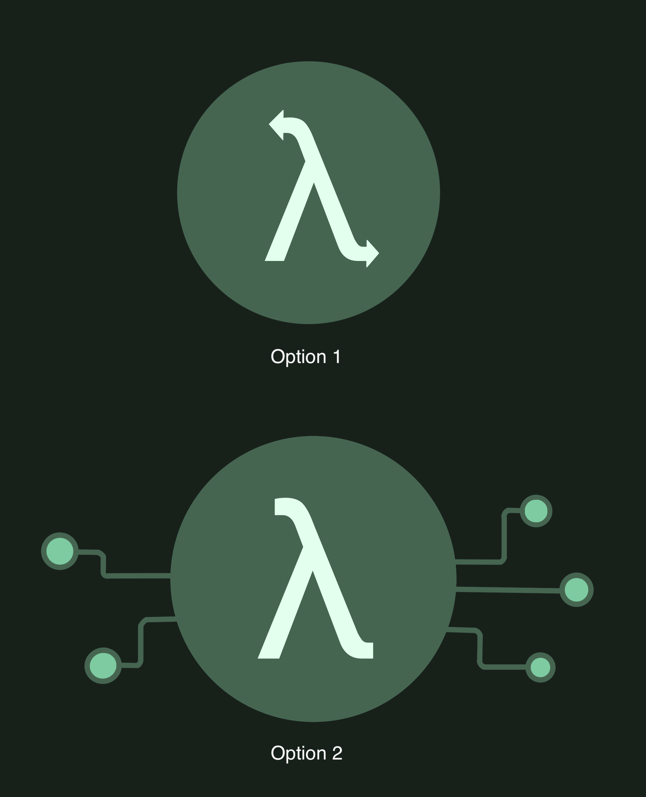
You can see that option 1 is pretty simple, I just applied the colour scheme to the initial ideas that
the client had. I believe it's important to include their initial thoughts, as it shows you
listened and cared about their opinion. It also helps trigger other ideas.
Option 2 came out of the idea that these lambda functions are all about connecting other bits of logic.
They could be composed to call one another or just be used in isolation.
Therefore, what better way than to show connectors? It is a bit busier than the first one, and
choosing it really comes down to the client's opinion on how well they think it suits their brand.
After presenting the two logos to the client, they picked option 2. It was an improvement
on what he had, so he was happy to try this theme first. Of course, we knew that we
can regularly review and make tweaks.
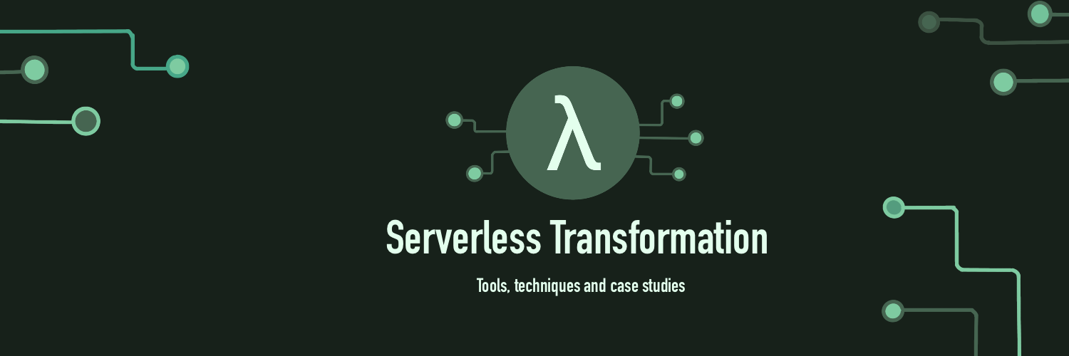
With that complete, I then needed
to create a Twitter background picture that would also use this theme.
Keep spacing in mind when applying the logo theme
A lot of social media platforms have background spaces, but a lot of that space is actually
overlapped with other pieces on the page. For Twitter, this is the actual profile picture
and a certain border around the background picture, depending on screen sizing.
When thinking about how to apply the brand to a background, you can go through a similar
process to what we did for the logo, but for this case I will admit
I ran with our current theme.
Since I wanted to emphasise the connectors, I added them around the border of the picture, leaving
out the bottom left corner, so the profile picture did not encroach on the space. I tried
composing them in a way that draws the eye into the center of the image, with the intent to emphasise
firstly the logo, then the name, and finally the strapline. I thought I'd add a little
colour variation in the other connectors for a bit more contrast.
Below is the final product:
How did I do?
I'm fairly new to trying to design logos, but I've started to do it because I find it a fun challenge
and I think it will help my design skills. I know it could do with improvement, so maybe if I
get the chance to do another iteration then I'll post an update.
I thought talking about the process may be helpful at least, just so others can see that this
approach is pretty flexible and can produce some decent results. I did this work within one evening with
the client so hopefully it goes to show that with a couple more sessions, it could be made even better!
Thanks a bunch to Serverless Transformation for contacting me about this work. If you're interested
in them, check out
their Twitter page, where you can also see the work done here altogether!
